There’s a funny thing that happens when designers stare at a project too long. The eyes stop seeing. The brain fills in gaps automatically, correcting errors that are actually there. A misaligned logo, an uncomfortable font size, a color that clashes slightly — all invisible after hours of work on a white canvas.
This is exactly why context matters. And this is exactly why a Business card mockup is more than a presentation tool — it’s a diagnostic instrument.
Why Your Brain Needs a Different Frame
Human perception is deeply contextual. Neurologically, we process familiar objects faster by relying on pattern recognition rather than careful observation. When you’ve been editing a business card layout for three hours, your brain has already memorized what it’s “supposed” to look like — and starts hallucinating correctness where there may be none.
Dropping that same design into a realistic mockup scene forces a perceptual reset. Suddenly the card sits on a wooden desk, catches light, casts a shadow. Your brain shifts from “designer mode” into “observer mode.” You’re no longer the creator reviewing work — you’re a stranger picking up someone’s card at a networking event.
That cognitive shift is genuinely powerful. It’s the same reason writers read manuscripts aloud, or architects build physical scale models. Changing the medium changes what you notice.
Hidden Mistakes That Only Appear in Context
Here’s what experienced designers consistently report catching after placing work in a mockup:
- Padding and breathing room issues — text or logos that looked fine on canvas feel suffocatingly tight once rendered at realistic scale against a physical surface
- Color temperature surprises — a “clean white” background can shift warm or cool depending on surrounding scene lighting, suddenly clashing with brand colors in unexpected ways
- Font weight mismatches — a typeface that reads beautifully on screen can appear too thin or too heavy when rendered small on a card surface with realistic texture
- Hierarchy confusion — elements that seemed balanced in isolation visually compete when seen as a finished physical object
None of these issues are obvious on a flat artboard. All of them become immediately apparent in a realistic three-dimensional scene.
Real Use of Business Card Mockups in Practice
Let’s move beyond theory. Here’s how designers and businesses actually use mockups in their workflows:
Freelance designer client approvals. Before sending a final file, a designer places the card in a clean mockup scene and shares it with the client. This single step dramatically reduces revision rounds — clients understand what they’re actually getting, and feedback becomes more specific and constructive.
Brand identity presentations. Agencies presenting complete visual identity systems use mockups to show business cards alongside letterheads, envelopes, and packaging. Seeing the card in this ensemble reveals whether it truly belongs to the same family — or subtly breaks the visual language.
A/B testing design directions. When two design concepts are competing, placing both into identical mockup scenes creates a fair comparison environment. Clients make faster, more confident decisions when options are presented consistently.
Proofreading under pressure. Deadline-driven studios use mockups as a final check step. Rendering the design in a realistic scene before sending to print has saved more than one project from embarrassing typos and spacing errors that survived multiple rounds of flat-screen review.
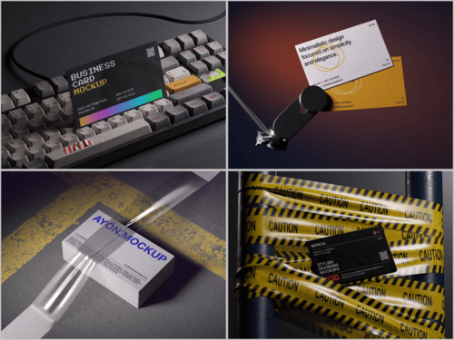
Business Card Mockups on ls.graphics
ls.graphics offers a standout collection of business card mockups built for professional use. The renders are ultra-realistic, with carefully organized layers that make customization straightforward and efficient. Scenes come in multiple angles and different color styles, set in stylish, minimalistic compositions that keep your design the center of attention.
The Edit Online feature lets you apply your design directly in the browser — no software installation required. And for those wanting to explore before committing, there’s a generous selection of free scenes available to try out. For designers who care about quality at every stage of presentation, this library is a serious resource.
Conclusion
The mockup isn’t the final product — but it might be the most honest moment in the design process. It strips away the assumptions that accumulate during hours of close work and shows you something closer to reality.
Using a realistic business card mockup as a review tool rather than just a presentation step is a small habit shift with a meaningful impact on output quality. The mistakes you catch before print are the ones your client never has to see.
Explore the collection at ls.graphics and build that extra checkpoint into your workflow. Your future self — the one who didn’t have to reprint 500 cards — will appreciate it.